Platform Design · Multi-Stakeholder UX · Learning Ecosystem · K–5
CPS Elementary Digital Learning Hub
Canton Public Schools, MA
Canton Public Schools, MA · 2020–2023
- Platform Design
- Multi-Stakeholder UX
- Learning Ecosystem
- K–5
Overview
The CPS Elementary Digital Learning Library began as a modest page for accessing technology lesson content. By the time it was fully developed, it had become something considerably more significant: a district-wide digital learning platform serving K–5 students, classroom teachers, specialist educators, and families across all three Canton elementary schools — a living resource hub that continued operating and growing long after its initial purpose had been exceeded.
This write-up describes the design of the hub as it was built and developed during my time at Dean S. Luce Elementary School from 2020 to 2023. The platform has since been updated and maintained by district colleagues. As an institutionally-hosted resource that transferred with the role rather than with me, the current version reflects ongoing district development rather than my original design, which is as it should be for a platform designed to be maintained by whoever comes next.
The design problem
Pre-COVID, the hub existed in a minimal form: a place to post links for technology class activities. When the pandemic shifted the Digital Learning Specialist role — and with it, the relationship between school, home, and digital learning — the platform needed to become something entirely different.
During hybrid and remote learning, students, teachers, and families were all navigating digital tools and learning resources simultaneously, often without support in the same physical space. The question the hub needed to answer wasn’t just “where do students go for technology class?” It was: how do we build a single resource that the whole school community — students working independently, teachers extending classroom learning, families supporting children at home — can use without needing someone to mediate every interaction?
That shift in question changed everything about how the hub was designed.
Architecture and design decisions
The hub was organized around two primary access patterns, recognizing that different users navigate differently.
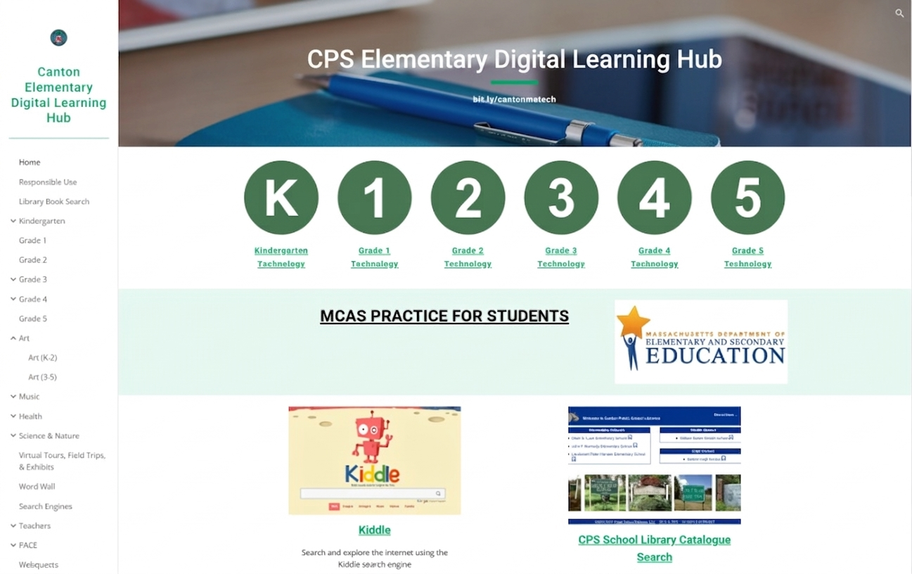
The homepage was designed for students — visual, immediate, and scannable. Grade-level navigation circles (K through 5) gave every student a clear and personal entry point to their own technology content. Subject tiles — Art, Music, Health, Science and Nature, Math Tools, STEAM, Virtual Tours — used images rather than text as the primary navigational cue, accessible to emerging readers and familiar to all. A short, memorable URL (bit.ly/cantonmatech) meant the hub could be shared verbally, written on a board, or posted to the LMS without friction.
The sidebar navigation served a more experienced audience — teachers, families, and upper elementary students comfortable with hierarchical navigation. Subject categories were divided into lower elementary (K–2) and upper elementary (3–5), where content differed meaningfully by developmental level. Audience-specific sections — a Teachers tab, a PACE section for specialist assessment platforms — sat alongside the student-facing content without requiring separate logins or separate platforms.
One deliberate design choice: no content on the hub required access controls or audience restrictions. Nothing in the teacher or family sections was inappropriate for students to encounter — it simply wouldn’t have been of interest or relevance to them. This removed friction, reduced maintenance overhead, and reflected a practical reality of school-facing platforms: children will find their way around, and the design should account for that rather than fight it.
The hub was also embedded directly into the DLCS curriculum as a standalone lesson — students were explicitly taught to navigate it independently. The resource hub wasn’t a supplement to the curriculum; it was part of it.
Multi-stakeholder design in practice
The three audiences the hub served had genuinely different relationships with the platform.
Students were the primary navigational audience. The visual homepage and grade-level structure were built for them. For students who excelled at a topic or were looking for more beyond the classroom, the hub gave them somewhere to go — independently, at home, at their own pace. Teachers and families directed motivated or curious students there specifically for this reason.
Teachers used the hub in two ways: bringing resources into existing classroom lessons and activities, or offering it as an extension when students had capacity and interest beyond the core curriculum. Having a centralized, organized resource library meant teachers across the school were drawing from the same pool — reducing duplication, improving consistency, and making it easier to connect cross-curricular work.
Families had access to the same resources their children were using, explained in accessible terms. During hybrid and remote learning, especially, this mattered enormously: families could see what tools their children were engaging with, find resources to extend learning at home, and understand the digital learning environment their child was navigating. The hub reduced the opacity of technology education for families who might otherwise have had no window into it.
One feature worth noting: the CANTON CREATES section showcased student work — including an art gallery where students’ chosen pieces were displayed by grade level. This was an early version of something the platform could have done more of: making student creation and contribution visible within the hub itself, not just within the LMS.
Reflection
The hub did what it was designed to do, and it kept doing it after I left — which was the goal. A platform that requires its designer’s continued presence to function isn’t really finished. This one was maintained, developed, and used by the whole district DLS team as a shared resource.
With the design thinking I’d apply now, three things would be different.
Integration with the curriculum. The grade-level technology pages housed the DLCS lesson content, but didn’t fully represent the curriculum’s integrated nature — the visible connections between digital citizenship, media literacy, computational thinking, and the rest. The pages would be richer and more coherent if they showed those relationships explicitly rather than leaving them implicit.
Stakeholder feedback built in. The hub grew through my observation of what was being used and what was needed. That worked, but it was informal. An embedded feedback mechanism — a simple form where students, teachers, and families could flag gaps, request additions, or note what was and wasn’t working — would have made iteration more participatory and more systematic. Students and families have insight into their own needs that observation alone doesn’t always surface.
Dedicated depth for teachers and families. The hub was strongest as a student-facing resource. The teacher and family sections were functional but thinner. Given that both groups had legitimate and distinct learning needs — teachers around technology integration and pedagogy, families around supporting digital learning at home — more structured, purposeful content for each would have made the platform genuinely multi-stakeholder rather than student-primary with supplementary access for adults.
Platform: Google Sites · Tools: Seesaw · Google Classroom · Clever · Common Sense Education resources
Context: Dean S. Luce Elementary School, Canton Public Schools, MA — Digital Learning Specialist, 2020–2023. Platform developed and maintained as a district-wide resource; has been updated by the district following institutional transition.