Visual Design · Accessible Design · Media Literacy · Upper Elementary
Media Literacy Infographic
A classroom questioning poster — redesigned for accessibility, print, and screen
Canton Public Schools, MA · 2023/2026
- Visual Design
- Accessible Design
- Media Literacy
- Upper Elementary
View the work
Open the accessible version (opens in a new tab) ↗ Download the printable poster (PDF) (opens in a new tab) ↗
The accessible version is built as HTML — it reflows on mobile, works with screen readers, and is printable; the poster PDF is the print/wall artifact. Both open in a new tab.
Overview
The Media Literacy Questions poster is a classroom reference I built for upper elementary students — a set of questions that help them interrogate any media they encounter or make, building the awareness, knowledge, and questioning habits they need now and as they head toward the wider media exposure of middle school and beyond. It began as a printed poster, and the format had a practical driver: the school had just acquired a large-format poster printer, and since I was training staff to use it, I needed a real piece to demonstrate with. So the original was made as a print and on-screen reference — for the wall and for display during lessons — rather than something students would open and use on their own devices, and at the time I didn’t get to a student-facing, digitally accessible version. This write-up covers both the original and a redesign that brings it up to the accessible visual-design standard I hold the rest of my work to, and extends it into something that also works on screen and with assistive technology.
It’s also the piece I’m most attached to, because it’s the most from-scratch. The questioning framework, the wording, the structure — none of it was adapted from an existing resource. It came out of building a media literacy strand that, at the elementary level, mostly didn’t exist yet.
The strand I had to build, not adopt
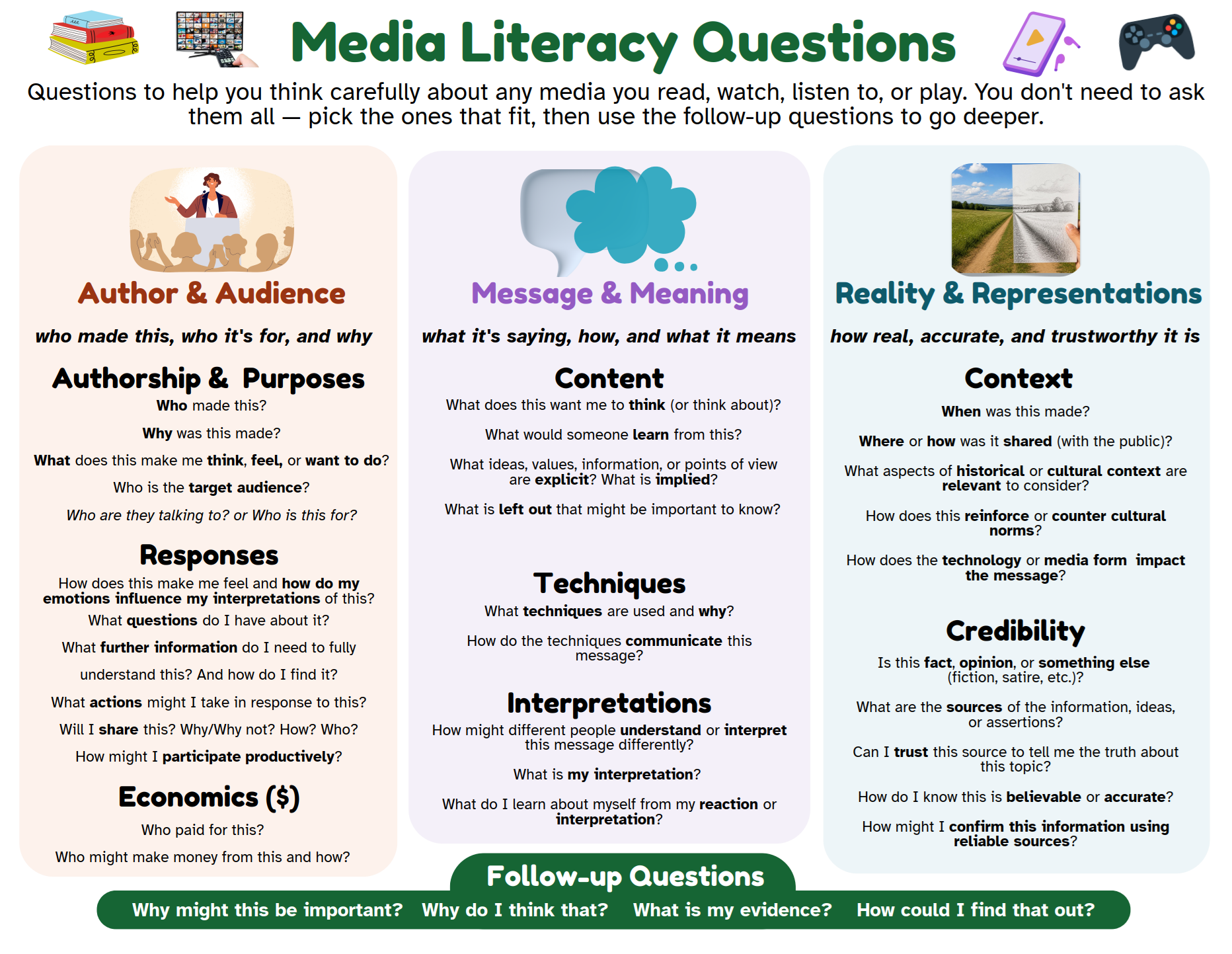
Media literacy was the part of my K–5 digital literacy and computer science curriculum that the available materials covered least. Coding, digital citizenship, and computational thinking all had decent resources to draw on. Media literacy at the elementary level was thin, scattered, and usually pitched at older students — so it was the strand I built up most deliberately, as a genuine K–5 progression rather than an occasional unit. The questioning poster is its most visible artifact: the inquiry routines the curriculum was building toward, distilled into something students could keep in front of them and return to across grades and subjects.
Consumers and creators
The framing I cared most about is that upper elementary students aren’t only audiences for media — they’re makers of it, earlier and more constantly than we tend to assume. A media literacy strand that only teaches children to question what they consume misses half the point if it doesn’t also ask them to take responsibility for what they make and share.
So the questions work in both directions. The same lens a student uses on someone else’s media — who made this, why, who it’s for, what’s left out, how trustworthy it is — is the lens they turn on their own work when they create and post it. The poster is organized into three areas: Author & Audience, Message & Meaning, and Reality & Representations, with a band of follow-up questions that push from a first answer toward evidence and reasoning. The categories are grounded in established media-literacy frameworks — NAMLE’s key questions and the Center for Media Literacy’s core concepts — but reworded and sequenced for elementary readers rather than borrowed wholesale.
The redesign — decisions and rationale
The original did its job on a classroom wall, but it wasn’t built to the standard I’d now hold it to, and it didn’t travel beyond print. The redesign is a set of deliberate decisions, each tied to a reason.
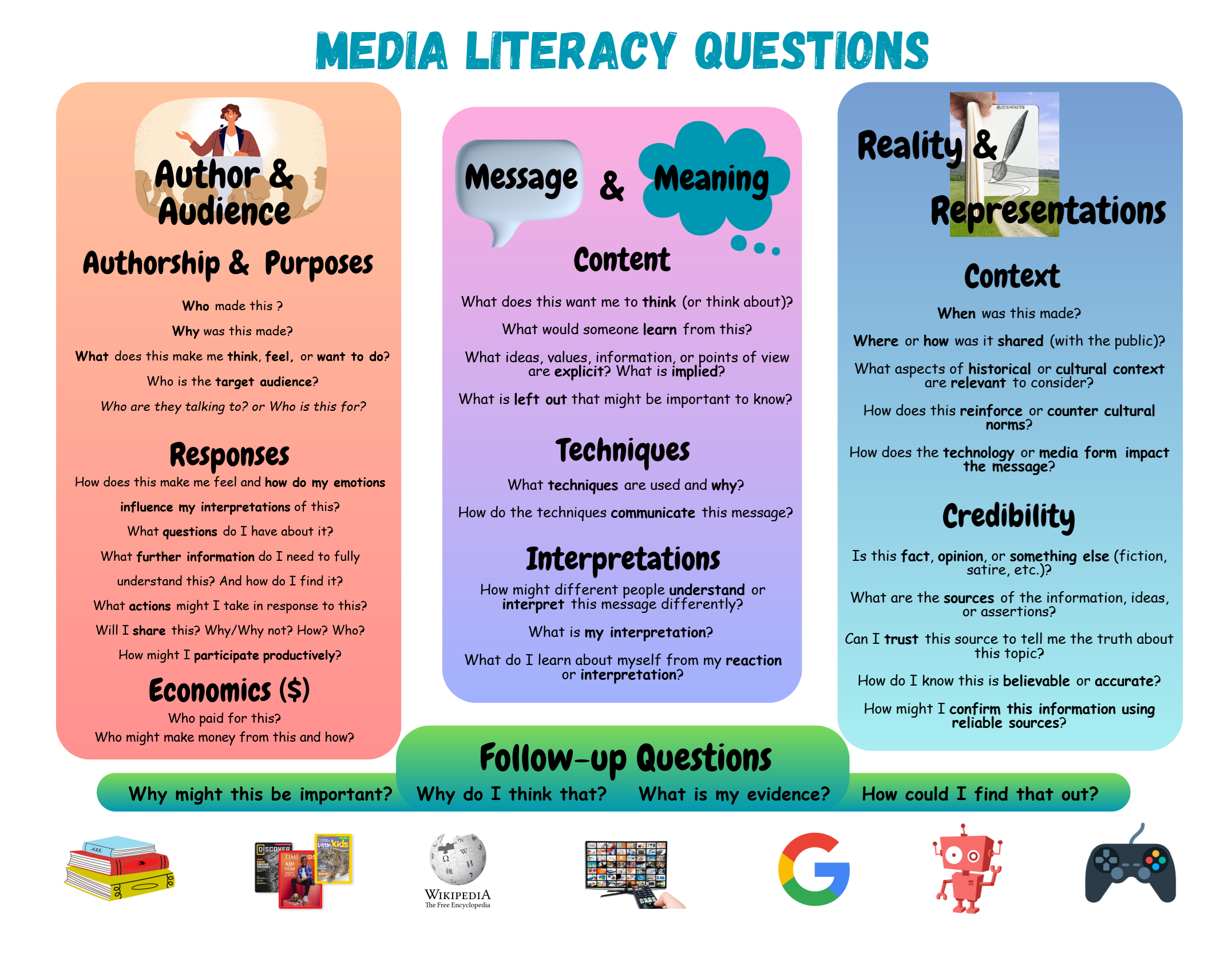
Contrast and color. The original used gradient panel fills, which means text contrast drifts across each panel, and a few elements didn’t clear WCAG AA at all. The redesign flattens every fill and verifies each text-and-background pair — all now meet AA, most reach AAA. Category color is no longer the only thing distinguishing the three areas (headers, icons, and position carry it too), so the poster still works for colorblind readers and survives the black-and-white photocopier every classroom resource eventually meets.
Type. The all-caps display font and the Comic Sans body type are replaced by a legible pairing — a friendly rounded display face and a body face engineered specifically for reading. Comic Sans is actually a little easier for young and dyslexic readers, which is why it ends up in classrooms; the redesign keeps that legibility benefit while losing the unprofessional read, by choosing a typeface built for the same purpose.
Guiding text. The original assumed a teacher was present to explain it. The redesign adds a short orientation line under the title — what this is and how to use it — and a one-line “lens” under each category, so the poster supports independent and semi-independent use. The restraint matters as much as the addition: just enough signposting to orient a student, not so much that it competes with the questions for attention.
Images. The original leaned on branded logos and a copyrighted cartoon — fine on a classroom wall, a problem the moment it’s published online. The redesign replaces them with a consistent set of original media-type icons, fixing the rights issue and the visual inconsistency at once, while keeping the pedagogical point the images were making: that all of these — books, websites, video, games, AI — count as “media.”
Two formats, one resource
The most useful realization in this redesign was that the most accessible digital version of an infographic isn’t an image at all. A flat export gives a screen-reader user nothing but alt text and won’t reflow on a phone. So the work splits into two deliberate formats: a print poster optimized for at-a-glance wall reference, and a digital version built as real HTML — structured headings and lists, selectable and searchable, reflowing to a single column on small screens, readable by assistive technology. The content stays identical across both; each format is shaped to the affordances of its medium. Holding that consistency while letting each version play to its strengths is the same modality problem I worked through in the Everything Vibrations project, in a smaller and more contained form.
What it demonstrates
This is the compact piece in my portfolio — the one that shows visual and graphic design craft, accessibility, and instructional scaffolding together in a single artifact, alongside the larger systems work elsewhere. It’s also honest about where it came from: a real resource I made and used in my own classroom, built from scratch because the strand it belonged to didn’t exist in usable form, now brought up to the standard I’d build to today. The redesign isn’t decoration. Every change traces back to a learner, it serves better.
Tools: Canva (poster) · HTML (accessible digital version)
Context: Created as part of a K–5 media literacy strand at Dean S. Luce Elementary School, Canton Public Schools, MA — Digital Learning Specialist, 2020–2023.